Youth Alive - Website Redesign
Role: UX Designer
Duration: June - August ‘21, September ‘23 - May ‘24
Team: Design: Third Slant | Development: Mangrove Web
Tools: Figma, Google Suite, Bugherd
Youth Alive is Oakland’s community based violence prevention, intervention, and healing agency.
In the Spring of 2021, Youth Alive’s Director of Development and Communications approached me about a number of issues with the Youth Alive’s website, including:
Visitors to Youth Alive’s website did not understand what the organization did. There was no cohesive message about what its programs were, the interconnectivity of their programs, or what the impact of their programs were.
Their website’s navigation and information architecture was crowded, leading to inaccessible information. In addition, the complicated IA made it difficult to actually make updates to their Wordpress website.
The website had a dated aesthetic, which made critical information difficult to read and distracted from important information about Youth Alive’s programs.
Based on these problems, we set out to ask:
How might we create a website for Youth Alive that accurately and beautifully conveys the mission, work, and importance of this organization?
Phase 1, 2021: Initial Research
In the summer of 2021, I was able to start this work by interviewing staff members, donors, designers and board members to better understand the needs the executive, staff and client level.
To find out more I conducted 6 interviews with YA staff members, donors, and a YA board member. I asked questions about their relationship to Youth Alive and its work, as well as their relationship with the website. I wanted to understand if they felt that their belief and understanding in the organization was something they saw reflected in YA website, and if they felt confident in sharing this as a resource for their peers, clients, or potential donors.
In addition, as I followed along on their screen I asked each interviewee to complete the following tasks to measure their ability to successfully find information:
Find the mission of Youth Alive
Find the services that Youth Alive offers
Describe the goals of this organization
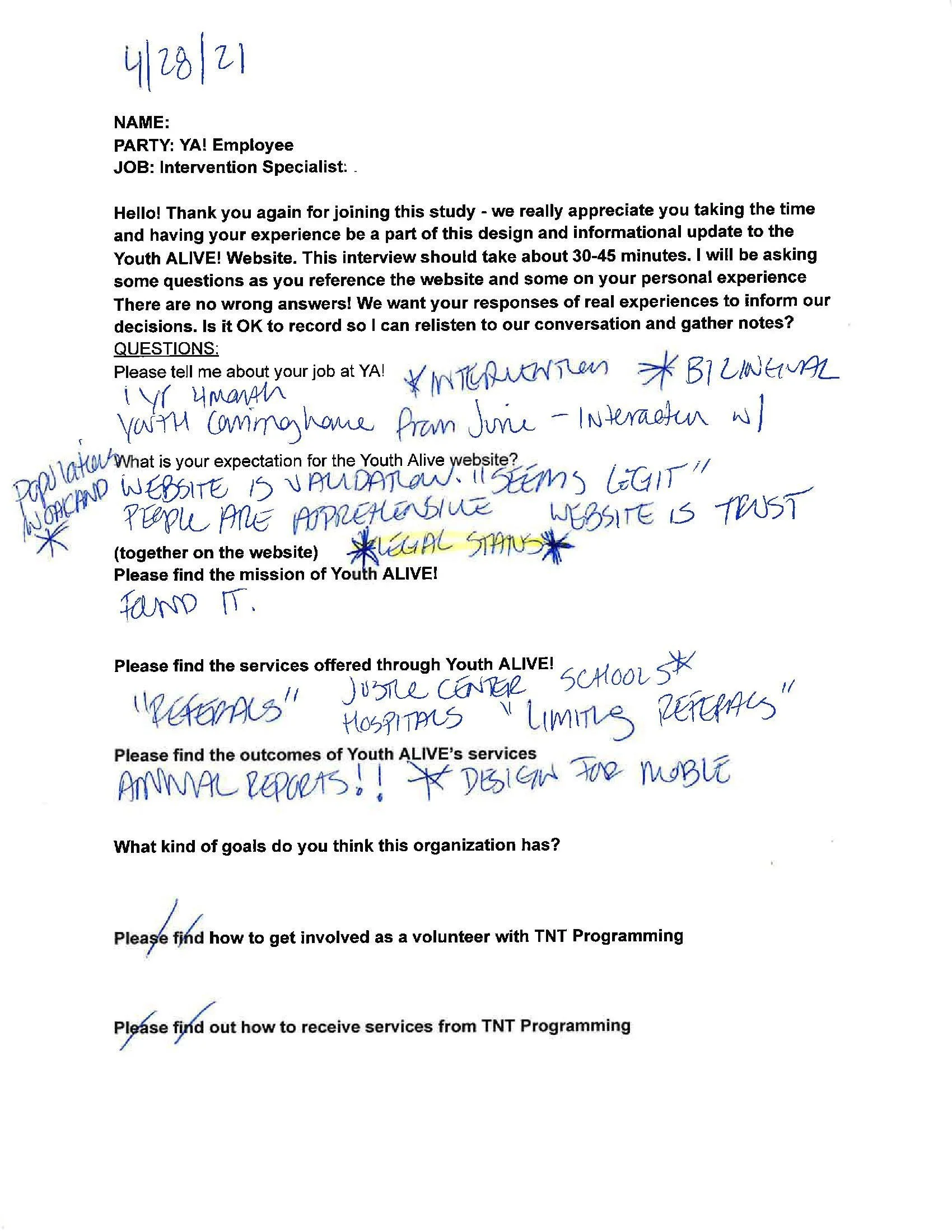
From this research, I found that users had significant trouble finding the mission and services of Youth Alive, as well as other basic and vital information such as information about programs and fundraising events.
Based on this research, and with the constraints of budget and website development challenges, I proposed two sets of changes:
Updating information architecture and navigation of the website, such that crucial information about Youth Alive’s programs was more easily discoverable
Easily implementable aesthetic changes that created a more visually accessible site.
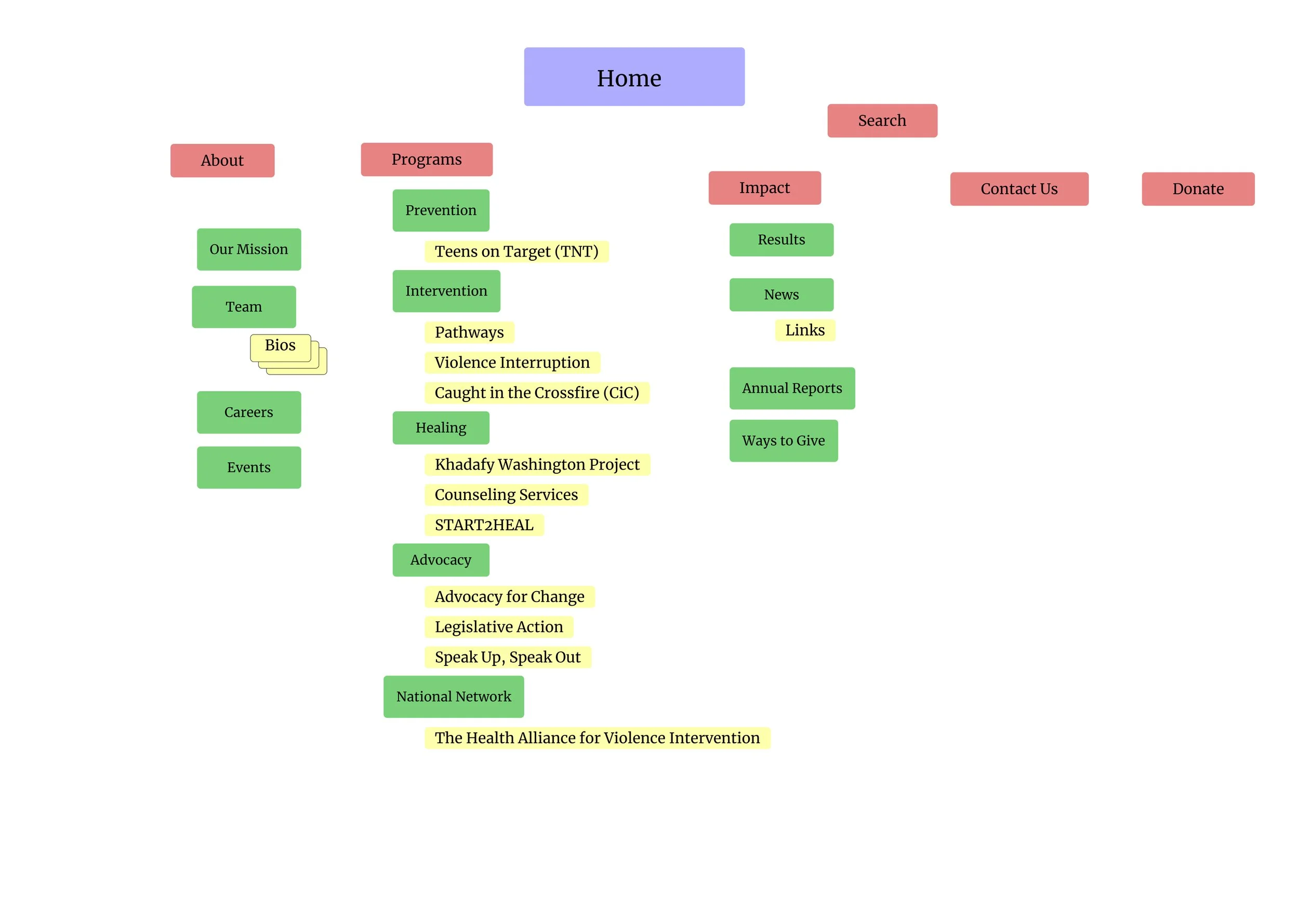
Original Site Map
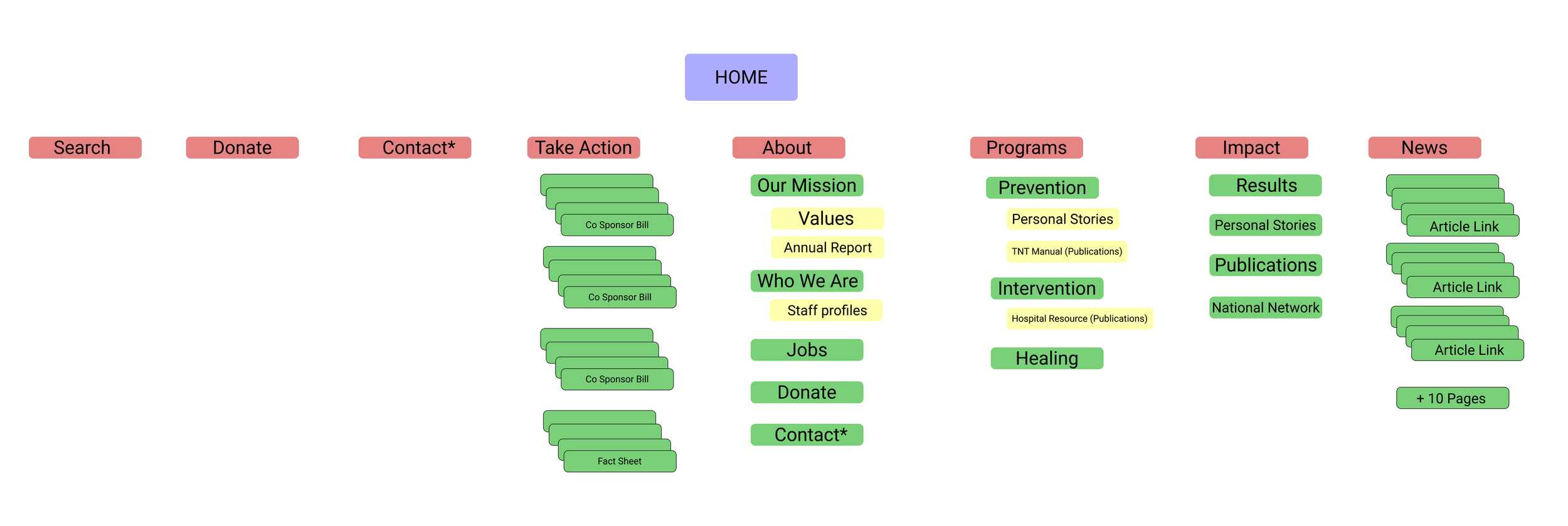
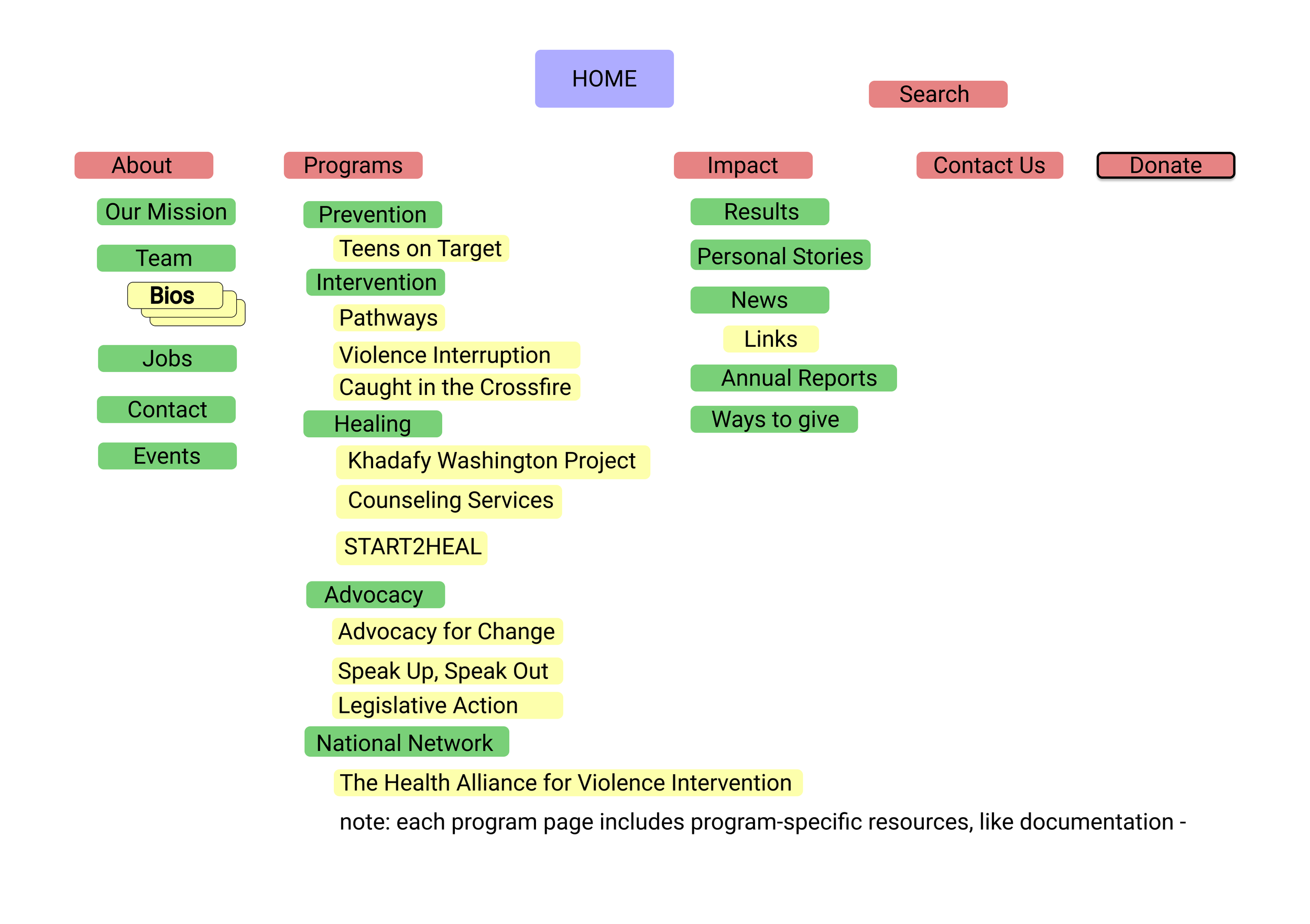
Top-level navigation was consolidated grouping information under single banners. Each program was given a dedicated page to make each program discoverable.
Based on this, I created pages that reflected the proposed site map and new ways of discovering information.
The aesthetic changes included removing a distracting tiled logo background, selecting a primary color based on an existing color, but darkening it to provide improved contrast, and adding button CTAs through key pages. The colors selected were based on those already in use, but darkened and used more minimally to create higher contrast and directing users to button CTAs.
Based on my recommendations, the Youth Alive team made slight updates to their information architecture, but decided to delay larger changes until their budget and capacity allowed.
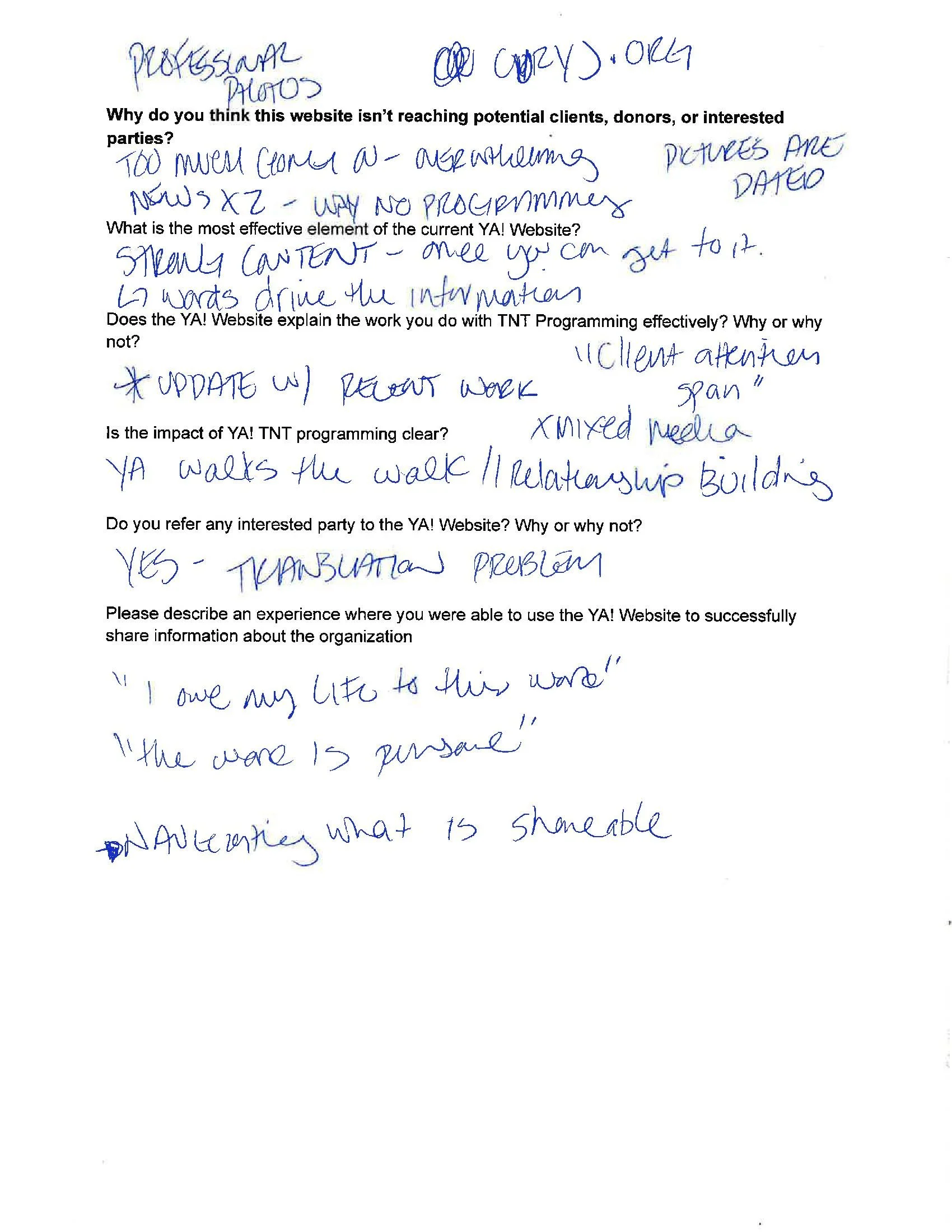
“Youth Alive does so much good and the website needs to tell that story” - Annual Donor
“I owe my life to this work. It’s personal.'“ - Intervention Specialist
“We do so many things, it’s a challenge to explain it concisely.”
- Board Member
Proposed Site Map
Phase 2, 2023: Brand Refresh
In the summer of 2023, Youth Alive now had the budget for more substantial website updates. I was approached by Joey Yang at Third Slant to revisit this project.
Based on initial conversations with our client counterpart, we understood that the issues I’d previously uncovered of unclear program descriptions, navigation, information architecture, and dated aesthetics had not yet been fully solved.
Additionally, two larger political events drove new urgency in this work:
Oakland was facing a $360 million budget shortfall, where funding for community violence intervention was one of the many areas considered for budget cuts
As part of the American Rescue Plan Act of 2021, the Biden administration announced nearly $500 million dollars in grant funding for Community Violence Intervention programs
To guide this work, we asked Youth Alive what goals they wanted to achieve while updating their brand. They told us these goals were their primary priorities:
Youth Alive wanted to make sure they could clearly communicate their work, its scope, and its impact to funders, not just within the city of Oakland, but to other grant-making organizations to give the organization the best chance at financial stability
Youth Alive wanted to claim the mantle of leadership in Community Violence Intervention, as they were one of the original community organizations creating new violence intervention methods over the 30 years of its operation, now used across the country and across the world
Youth Alive’s new Executive Director indicated his willingness to re-examine the brand holistically, so we proposed a complete brand refresh to establish the brand’s foundation, including mission, vision, and visual and verbal identity.
Staff Workshop #1
In early fall we invited a cross-section of Youth Alive staff to a workshop to re-imagine what their brand could be.
Staff from each program and administrative department were invited to participate in a brand foundation workshop. The goal of this workshop was to establish the brand’s foundation, including defining the organization’s mission, vision, and core values.
After some fun icebreakers, we ran 3 exercises to understand different ways to describe and learn more about Youth Alive.
Elevator pitch: Youth Alive staff were asked to write an elevator pitch for this organization; a brief introduction getting across a key point or two and making a connection.
Functional vs. Emotional benefits: What does this organization do for its clients, and what kind of feelings does that create?
Dreamscaping: Finally, Youth Alive staff were asked to describe the world in which the organization has succeeded in its goals.
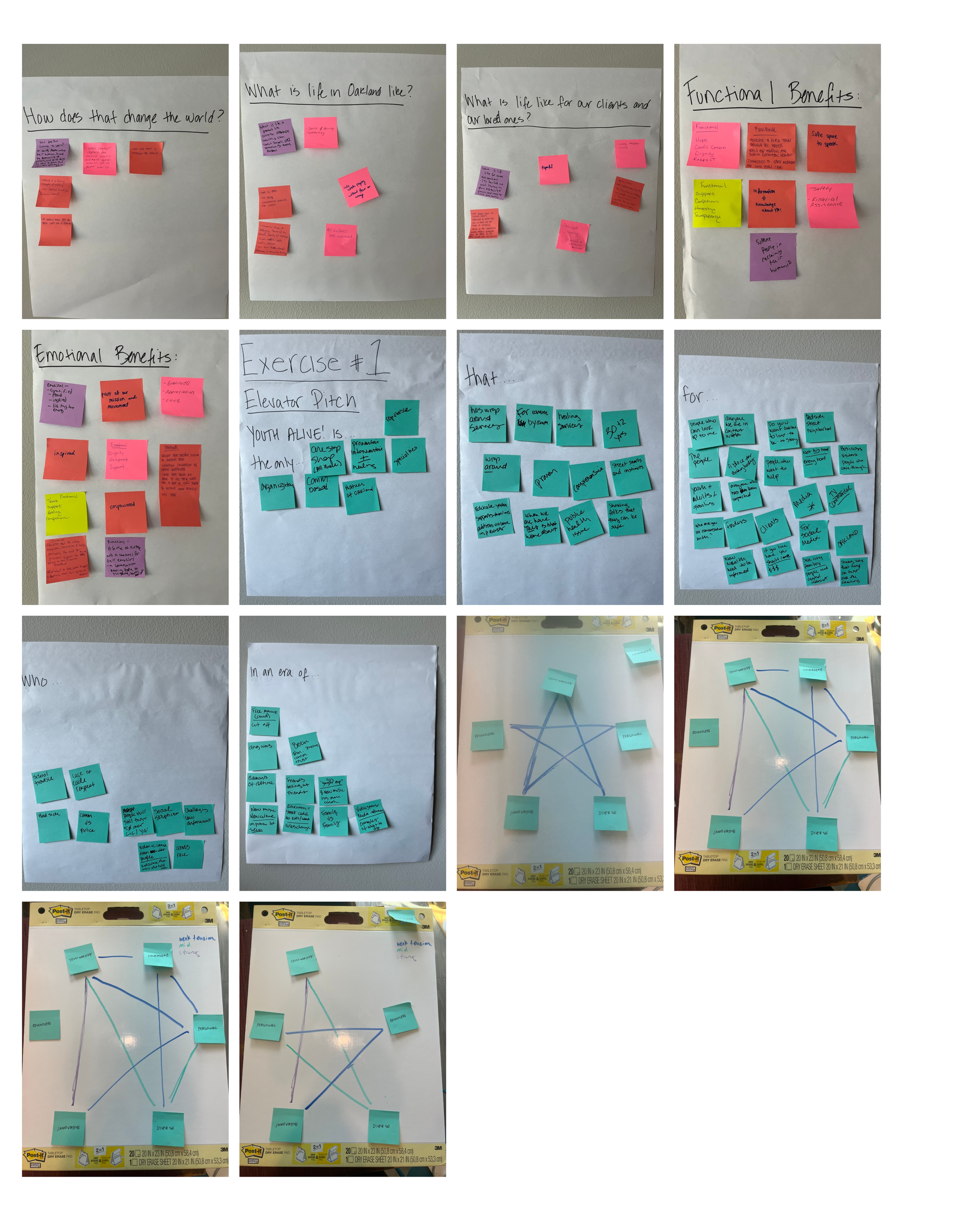
We were lucky to hear from Youth Alive staff and their journeys as young people, and adults living in Oakland and working for Youth Alive. A refrain we heard, again and again, was “This work is personal to me”. Staff have first-hand experience with violence, with intervention, and with the healing work they now perform with and for their neighbors. Each person felt a sense of duty and purpose in making this change for Oakland.
While I understood what Youth Alive’s work and goals were from an outside perspective, I was deeply impacted by the personal stories and the grace with which the staff diligently work day to day to create a better city. Hearing how deeply the staff cared about their work and their clients, we knew that the Youth Alive brand had to reflect the personalities, attitudes and dedication.
Research
We wanted the new brand identity of Youth Alive to reflect the brand’s personality. We wanted the authenticity and passion of local movements and revolutionaries to inspire this new aesthetic. We wanted to do this research because we heard a lot of love for the city of Oakland. This brand should reflect the grassroots energy of the town. We decided to seek inspiration from local movements and figures. Our workshop participants cited local movements in the city of Oakland. To make sure that we understood the cultural context that our participants were citing, we decided to start our local research at the Oakland public library on Telegraph Ave. We asked the librarian for references on local history. While they had some reference material, they recommended the library’s main branch and their history room.
Based on that recommendation, Joey and I took a trip to the Oakland Public Library’s main branch History room where we were able to view photos, posters, pamphlets, newspaper clippings, ephemera, and exhibits showing the Black Panther Party, Vietnam protests, labor organizing, and Black Lives Matter.
The librarian from the Oakland Library history room also recommended the Chavez Library Poster Collection which houses ~250 posters made by local artists and activists.
Out participants described the feelings of safety and community as young people in Oakland. We wanted to draw inspiration from the Oakland’s singular culture.

We also drew inspiration from other violence prevention organizations at the local and national level. We hoped to follow convention, and be guided by how other orgs have structured information and calls to action on their own websites. We were inspired by March for our Lives, Giffords Center to End Gun Violence, Roots Community Health Center and HAVI.
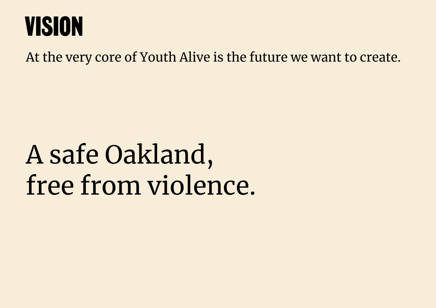
To create copy and brand guidelines that were held close to the feelings we wanted to convey, we drafted Youth Alive’s Mission, Vision, and a brand star of 5 values Youth Alive represented, based on what we heard from our workshop participants. This brand foundation would dictate the direction we would go to create the rest of the elements of the brand.
Our goal in drafting updates to these was to simplify them to be easily shared and remembered by staff and Youth Alive’s partners including clients, elected officials, and peer organizations.


Based on different expressions of the organizations core values, we created three brand concepts for Youth Alive.
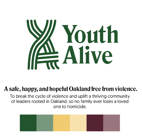
“Trustworthy” Concept
Design
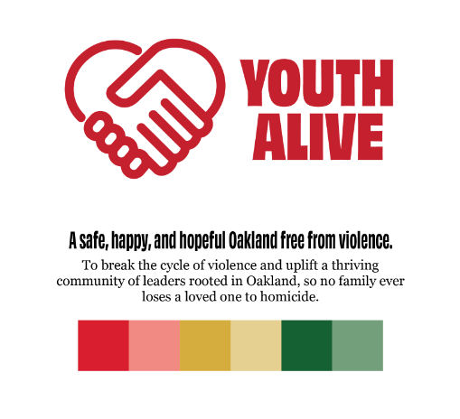
“Personal” Concept
Staff Workshop #2
We asked Youth Alive staff to join us for a second workshop. We presented the brand foundations of Mission, Vision, Values and our three brand visual explorations for review.
We showed the YA team our draft versions of the updated mission, vision, and values, and while the team agreed with the general direction of each of these, we updated certain phrases to more accurately reflect the work done across the agency and its goals.
“We want to make people happier & more hopeful but what YA actually does is make people safer”
“We provide services for those impacted by violence - naming that this is how we see the work we do - when i’m talking about YA with somebody i bring out the [program] buckets really quickly”
Next we shared our visual design explorations. To encourage the YA team to give us their unfiltered opinion, we made it clear nothing was precious and prompted them to speak candidly about what they liked, disliked, and wanted to see.The vital feedback from YA staff provided honest feedback.
Didn’t want to be confused with the city
The purpose of the organization might not have been identifiable enough from just the visual identity
They liked the green color because it reminded them of Oakland
They needed the identity to work in the streets and represent what they do
There was a lot of emotional attachment to the existing logo]
Based on this feedback, and based on Youth Alive’s goal of claiming the mantle of leadership within the CVI movement, we decided to continue using their existing logo with several modifications to give the letterforms more consistent shape and spacing and update the primary brand color to green to reflect Youth Alive’s roots in Oakland.
Brand Standards
Visual Identity
“Relentless” Concept
We presented these three options in a second workshop for Youth Alive staff to review and give their feedback.
Based on the workshop feedback, Youth Alive’s redesign goals, and conversations with our primary client partners, we selected the most “relentless” brand identity direction, which was to revise and extend their current brand, while updating and expanding the brand standards for brand foundation, visual identity, verbal identity, and brand application examples.
Brand Foundation
We used the workshop feedback and the staff’s own words to create clear and concise statements for Youth Alive’s vision, mission, and values, so that they are memorable for staff and Youth Alive’s audiences.


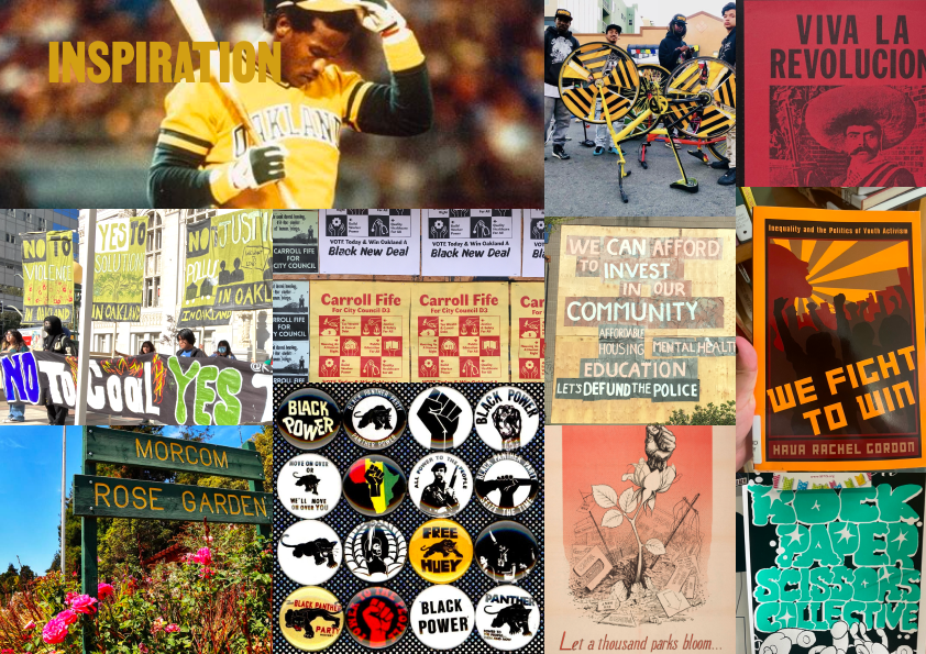
First, we compiled a mood board to inform the visual identity of YA’s brand, drawing on the various inspirations YA staff cited as well as our field research. Based on this, we felt YA’s brand should use the visual language of social movements, such as hand-drawn letterforms and artwork and bright colors taken from Oakland’s landscape.
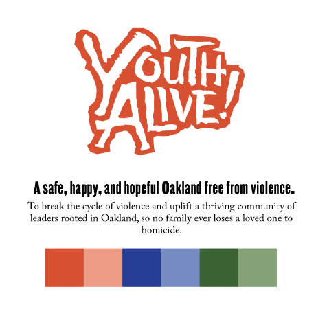
We decided to continue using their existing logo with several modifications to give the letterforms more consistent shape and spacing and update the primary brand color to green to reflect Youth Alive’s roots in Oakland.
This brand identity would also feature the original Youth Alive logo in the new signature Oak green to better represent the friendly, rooted experience of clients and staff versus the original red. With their relentless energy and work, we added a yellow Brass, bright pink Rose and grounding Infield.
Based on the organic and hand-drawn letterforms we were inspired by in our field research, we chose our hero typeface, Martin, by Vocal Type Co. “nonviolent” typeface inspired byMartin Luther King Jr. and signs created for the Memphis Sanitation Strike of 1968. This rich historical reference also came with bold and asymmetric letterforms that speak to the relentless energy of Youth Alive.

We were inspired by classic, bold colors that represented the energy of Oakland, with our “Oak” color as part of our primary pallete, the use of green reinforces our connection to the city of Oakland and signals the hope, growth and change that is to come.
Verbal Identity


Our Hero Typeface Martin, is designed by Black-owned type foundry Vocal Type Co. This type was inspired by the signs created for the Memphis Sanitation Strike of 1968 and represents Youth Alive’s relentless energy.
In addition to the color palette, we provided Youth Alive with a reference for what colors can be used together for accessibility, where we vetted each color combination to make sure it met minimum Web Content Accessibility Guidelines (WCAG) standards for contrast.

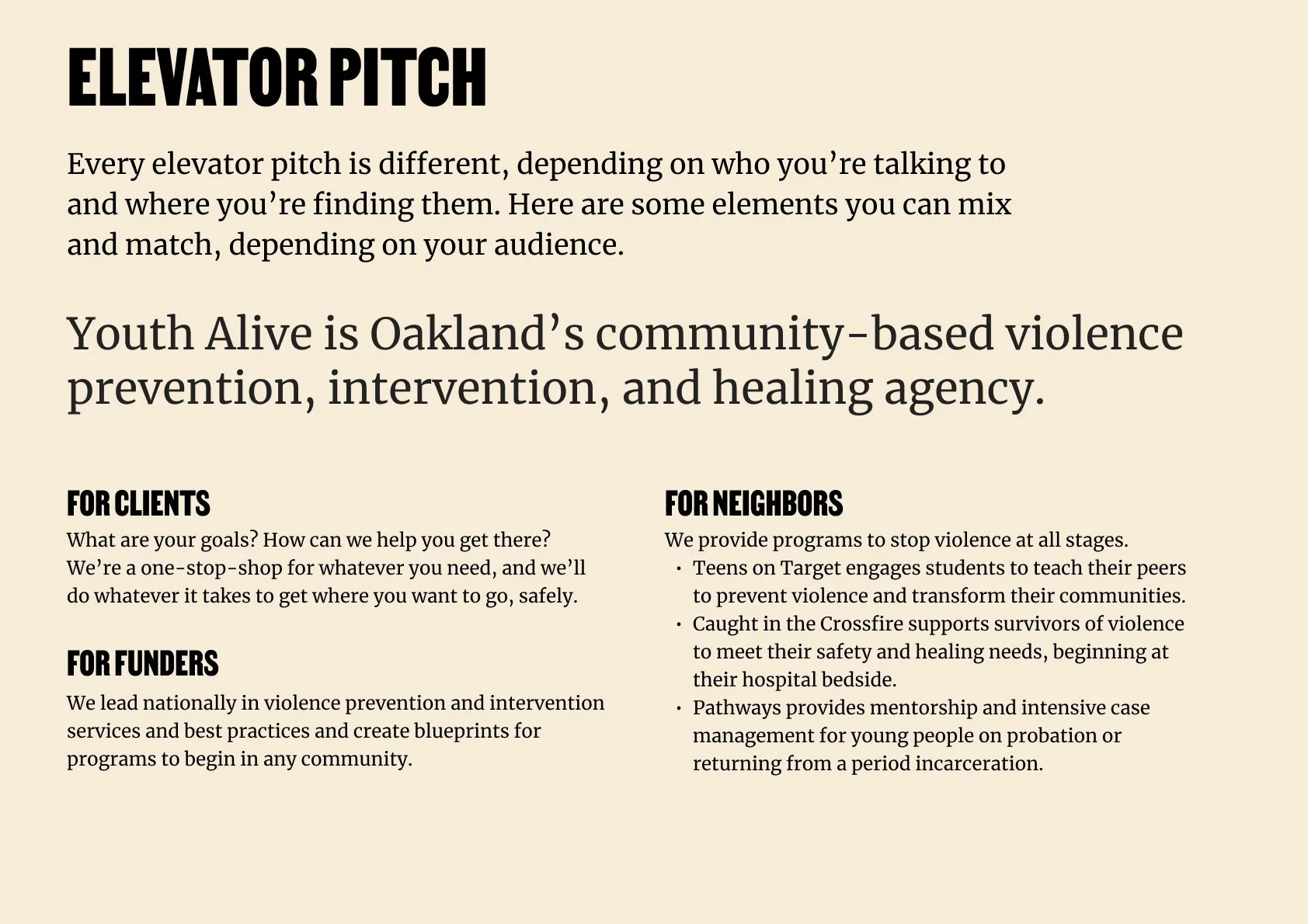
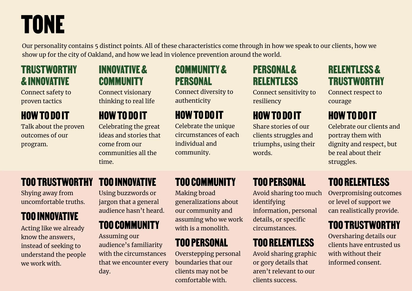
We created guidelines for Youth Alive’s verbal identity that highlighted the history and relentless dedication of the organization as well as the personal approach and authenticity of Youth Alive staff in an elevator pitch, value propositions for its audiences, and frameworks for the tone of new copy.
Brand Applications
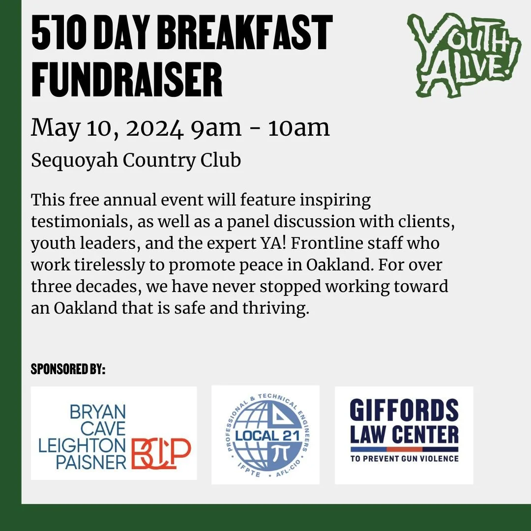
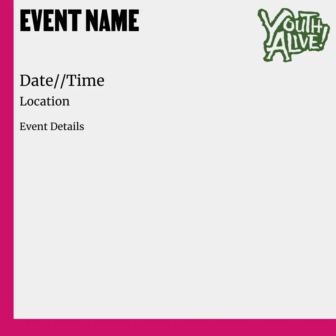
We created new brand assets including letterhead, business cards, flyers and merchandise mockups to make sure their new brand extended to all touchpoints with its audiences.

Phase 3, 2024: Website Redesign
With the brand identity established, we then proceeded to design Youth Alive’s new website. With each iteration, we worked closely with the Director of Development and Communications at Youth Alive, Lauren Greenberg who provided valuable feedback from an internal lens and connected us to subject matter experts to make sure we were getting the organization’s message correct.
We started by detailing the original problems described to us by Youth Alive.
The website’s messaging was unclear about what the organization’s work was. In our research with Youth Alive’s staff and board members, everyone had a different explanation of what the organization did.
The current website did not make it obvious what the organization did, how you could get services from them, or how you could get involved as a donor or volunteer.
Potential donors could not easily find critical information about Youth Alive’s effectiveness, including its annual reports and impact statistics. Additionally, there was no pathway for these donors to contact the organization specifically regarding fundraising.
During research interviews, Youth Alive staff used words like “cluttered” or “crowded” to describe the site. The former site used many layers of backgrounds, logo patterns, and photographs as visual elements. All of these options together created busy pages that did not direct visitors directly to information.
Our designs would provide clear solutions to these problems by
Answering the questions of “What is Youth Alive?” and “Is Youth Alive for Me?” above the fold
Begin explicit in the programs that Youth Alive runs and creating dedicated pages for each that included personal stories, impact data for funders/donors, resources and contact information
Creating a page for Annual Reports both current and archival for easy access.
Removing extraneous copy and images making a cleaner site to read and learn about Youth Alive.
Information Architecture
Similarly to the work in 2021, our first task in designing a new website was to create a new sitemap to restructure the information hierarchy. Our goal was to simplify the top-level navigation to create more obvious categories for content and pathways to new pages such as Annual Reports and Ways to Give.
This consolidated navigation, which reduced the top level navigation from 9 items to 5 items, would clearly direct visitors to the most valuable information about the organization.
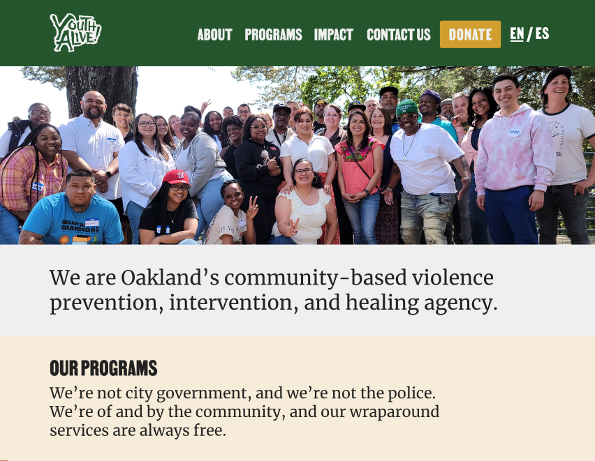
Youth Alive’s Message
One of our top priorities was to ensure this website could provide obvious answers to the questions “What is Youth Alive?” and “Is Youth Alive for me?”. Based on our workshop participants’ responses to our elevator pitch exercise, we decided to lead with the elevator pitch description of Youth Alive above the fold on the website. Because so many of our participants’ responses included specific details about the program that they were affiliated with, and because Youth Alive’s work is so broad, we decided to list an elevator pitch summary of each program on the home page so visitors could quickly understand the vast scope of Youth Alive’s services.
Impact
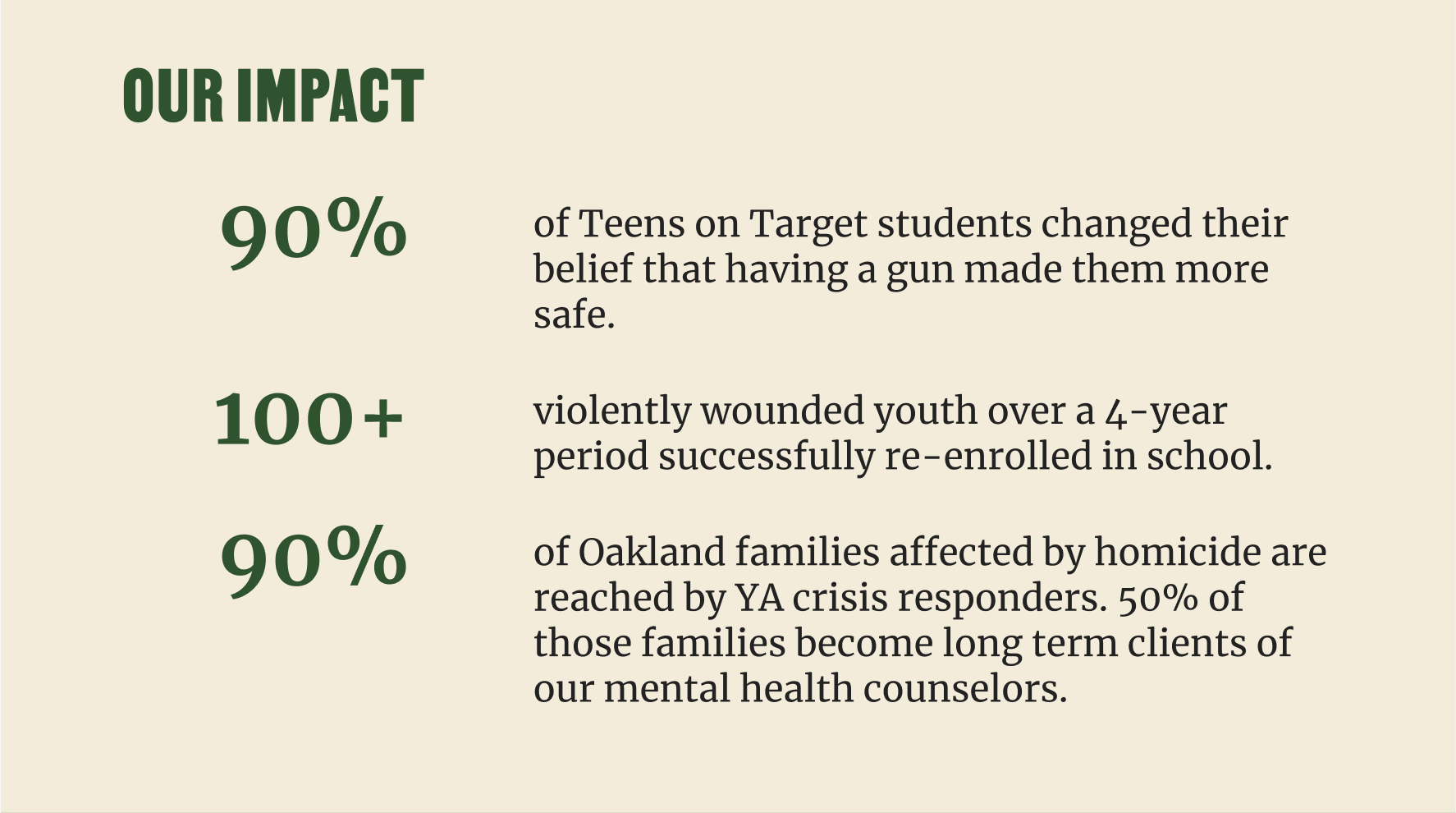
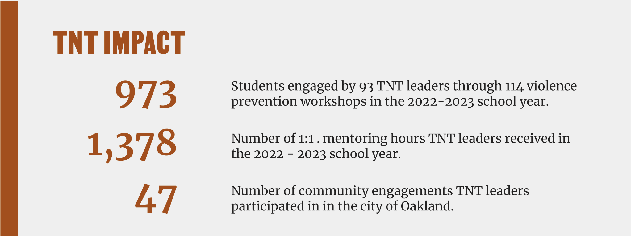
One of the primary user personas the website had to serve was potential donors to Youth Alive. In our research, we understood that Youth Alive’s impact had to be clear and obvious to these users. The impact of the organization as whole was previously featured in linked out annual reports, but the granular impact of each program was not clear.
To solve this, we added an “Impact” section to the homepage, which highlighted a few of the agency’s top-level impact metrics, with a link to a dedicated impact page that shared impact statistics for each of Youth Alive’s programs. On each program page, we also added a similar impact tile so visitors could understand the impact of each program in the context where they were learning about it.
Annual Reports
Annual reports are a vital way to share a holistic view of an organization as they work towards their vision each year. Youth Alive uses their annual report to call in new donors and to open new doors for partnerships. Youth Alive’s annual reports were given their own page and used the embed to share the most current 2023 report on youthalive.org. We also added tiles below that linked to past years’ reports.

Aesthetic
Using our color palette, we used neutral or light backgrounds and our full saturation colors to create a more cohesive effect. These colors acted as callouts to each program bucket and to important information headings.
Each page used the same blocks in the same color combinations for resources, staff contacts, and calls to donate. These blocks created a reliable path on each page to guide visitors to additional information or to donate, as well as create consistency for the website’s developers to meet Youth Alive’s website development budget.
Development + Launch
Development of these designs were built by Mangrove Web. Mangrove’s web development took a total of 6 weeks. Using Bugherd, development of this site went through 2 phases of QA, where we focused on identifying areas where the developed website differed from the designed version, as well as ensuring the site was responsive to different breakpoints, from mobile to tablets to desktop.
This new design was launched on April 30th, 2024 and was announced to the Youth Alive community on May 10th, “510 Day” their annual fundraising day.
Results
We have received great feedback from both Youth Alive on the design and development of the new YA site.
Below is an excerpt from Lauren Greenberg, Director, Development and Communications:
From the very beginning, Third Slant went above and beyond our expectations. Their team demonstrated an impressive level of cultural awareness and sensitivity, ensuring that every aspect of our new branding accurately reflected and respected the diverse communities we serve. This was no small feat, and their commitment to inclusivity was evident throughout the entire process.
One of the most remarkable aspects of Third Slant’s approach was their inclusivity in gathering feedback and creative direction. They involved multiple stakeholders, including our staff, clients, and Board members. This collaborative effort ensured that the final product truly represented the collective vision and needs of our organization. ThirdSlant hosted numerous listening sessions, creating a space for everyone to voice their ideas and concerns. This inclusive approach not only made everyone feel valued but also enriched the creative process, resulting in a branding guide and website that we are all proud of.
The result of Third Slant's hard work is a stunning branding guide and a dynamic new website that effectively communicates our mission and values. We have received countless compliments from our community, and we are confident that this refreshed online presence will significantly enhance our outreach and impact.
Both professionally and personally, I am deeply proud of this project. I am thrilled to have seen this product launched nearly 3 years after the first discussions between myself and the Youth Alive Development Team and I am excited to see further impact of this new way of story telling for the organization.
Stewarding this redesign from the more limited needs, design, and implementation in 2021, to this new website and additional collateral through 2024 has been a fun and collaborative journey. Lauren Greenberg, Director of Communications and Development, was open to all avenues of change, and ready to share her thoughts as well as give us access to staff stakeholders.
I am equally grateful to have worked with Third Slant on this project. Joey Yang recruited me to partner with him and grow as a designer. He was patient and supportive of my development through the research and design on this project. The final product is a true reflection of his long standing dedication to Youth Alive as a supporter and as a designer who thinks holistically about user and client needs.